

The easiest way to assess a good content is to look at the number of likes & the comments .
If a content gets a lot of likes and comments, it means that the content has good quality and proven liked by many.
However, this approachis not suitable to analyze old contents.
Why? Because there is a difference in the amount of followers and Instagram algorithms when the content is posted.
The amount of followers will surely affect the amount of likes you’ll get. And we can't figure out how many followers of that Instagram account when the content posted, let say 1 or 2 years ago.
Therefore, one of the ways we can use is by comparing the amount of interactions of one content with others in the same time period.
We can do it easily with one of Virol's features: Post Performace.
In this chart you will see a variety of dot spreads in yellow and blue areas.
Notes:
Standart Deviation is one of statictics formulas to determine the normal range of data spread. You can learn more in this article.
To use this chart, you don't have to be dizzy with the above terms or find out where the calculation is from.
Just look at the position where the point resides.
Posts located at:
The underline is, the higher the dots from the average line (black line), the better its performance.
When I research content for my Islamic niche Instagram account, I found an old content in an Instagram account with its post performance analysis as follows.
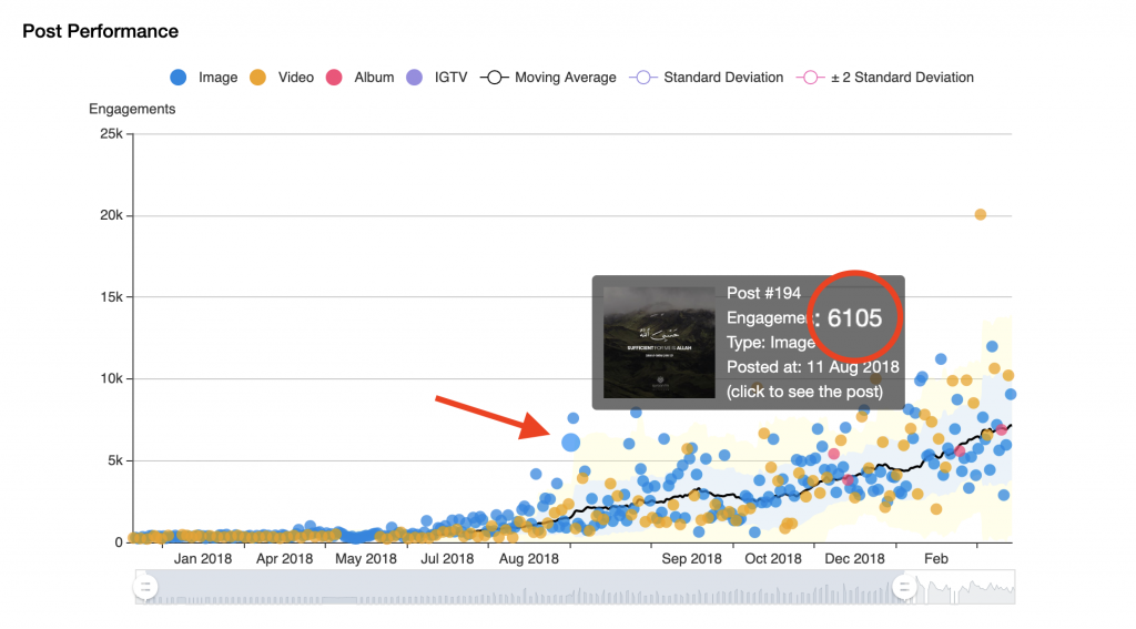
If you see in the graph, the interaction of that post is indeed not as many as its latest posts. But if you see its position, the dot resembling the post is located above the yellow area, which means it has great potential to be viral.
Then I reposted the post to my Instagram account with a more appropriate hashtag and in the effective time (where my followers are active on Instagram).
The result is, that repost went3x times more viralthan its original.